Video Editing using PowerPoint

Hello my lovelies!

Today I’m giving a quick recap on how I created and edited a video using our old friend PowerPoint. I actually didn’t know that this function existed until this course, but now that I do I will definitely make use of it in the future.

After choosing my theme, I chose the footage (pictures and videos) I wanted to present and made slides for them. I chose a design for each slide, inserted text boxes and added a soundtrack through “Audio” in the toolbar, and removed the original audio from some of the embedded video clips. I also added animations for the text on the slides.

Finally, I exported the PowerPoint as a video and watched it once to make sure it turned out the way I wanted to. I added the video to my Youtube channel as an unlisted video, so anyone with the link can see it, but no one else. You can check out my video here:

Thanks and see you next time!

My Virtual Visit to Taj Mahal

You know how you take pictures on a trip but somehow lose all of them? Yep, that happened. I lost my pictures from my visit to Taj Mahal. So for my first photoshopping task, I combined a picture of me and a random picture of the glorious marble mausoleum in Agra. As you can tell, I am definitely not a professional, but the following are the brief steps I took to achieve the outcome.

I used the site http://www.photopea.com to edit my image because not everyone can afford to get PhotoShop. So, if you’re in need of a similar application, you can always use Photopea’s browser version. It pretty much has the same functions.

The image I found of Taj Mahal online was good quality, so I didn’t need to edit it further. I only added a text layer, wrote my greetings, added a curved warp so the text arched over the dome of Taj Mahal, and then I added the date underneath it. Next, I chose a picture of myself, then cropped it and used the quick selection tool on it to remove some of the extra background. This part was very tricky, as the different selection functions never seemed to select the area I wanted, but maybe this was also due to the type of picture. Anyway, I refined the edge, more or less got the area I wanted and then resized the image, reducing the pixels from 1548 to around 500 pixels or so. This way the picture of me was of a realistic size at the front of the final image.

Basics of Image Editing

Hi, folks. Today I’m briefly going to cover what I have learned about basic image editing using the web-based app Pixlr X.

Here I have posted one original, unmodified picture and four modified ones. The first one on the left, top row, is the original picture. The rest:

  • Center, top row: Re-sized and cropped. I removed parts of the image and made it smaller. Cropping enables you to remove “extra” material, i.e. anything in the background you don’t want the audience to focus on. Re-sizing may alter the quality of the picture, especially if you make a picture bigger.
  • Right corner, top row: Contrast and brightness. I decreased the brightness and increased the contrast of the picture. There is a very fine line here, because it is easy to go overboard with either one. If there is too much contrast, the image will look unnatural and lose detail due to increased saturation; if it’s too bright, it will also lose detail and make the background grainier. But you want to be able to SEE what’s in the picture and make it look vivid.
  • Left, bottom row: Saturation. I increased the saturation a tiny bit here. Saturation increases the vividity and richness of colors, which is good if the picture is somewhat dull or muted. Like mentioned before, increase saturation too much and the image will look unnatural and lose detail.
  • Right, bottom row: Sharpness. I sharpened the image a little bit for this one. Sharpening helps the image look clearer and crisper, if needed, by enhancing the edges and borders of objects. Too much sharpness will make the image look worse, exaggerated and less-detailed.

I have used these functions before in today’s social media age, but it is good to know the reasons WHY behind some of them, WHY certain functions make pictures look the way they do.

Toodle-oo!

The Importance of Being… On LinkedIn

In this post, I will cover a mere few of the multiple professional reasons and advantages for being on LinkedIn. Without further ado, let’s get started:

  1. The most obvious one: getting discovered by someone who needs your skills and expertise for a job. This is especially true if the potential employer is a person you would be very unlikely to meet by chance in real life due to a number of reasons.
  2. Creating a wide network. This will help in raising the likelihood of #1. It might also be beneficial to your peers who you know to be on the prowl for a job.
  3. Wide-ranging job listings. You’ll be able to discover more jobs, across different fields and localities. LinkedIn has a pretty top-notch search engine, and some job ads are even exclusive to LinkedIn.
  4. Stay up-to-date. Maybe it’s in your field, current business trends, news or simply with your business connections, but keeping up with the times will aid you professionally.
  5. Demonstrate your modernity and professionalism. Recruiters will see that you are utilizing current tools and be able to easily and quickly view your experience and skills.

These are the main reasons for being on LinkedIn that I wanted to highlight. Obviously, these are from the point of view of applicants, but there are similar and distinct reasons for recruiters to use LinkedIn as well for hiring employees.

Thanks and see you next time!

Creating site icon and logo

For a more personalized touch, I strongly recommend creating your own site icon and logo. This way, your readers can instantly associate similar-looking things with you and recognize you and your brand.

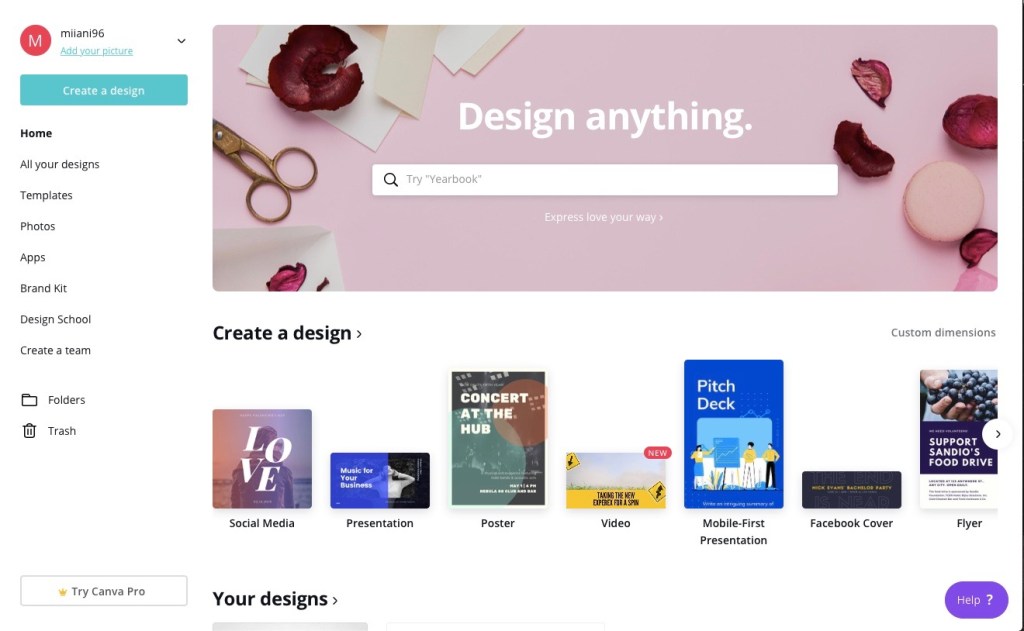
An easy way to get started is to use a built-in app on your laptop, like Windows Paint, or lacking that, a free website. I myself used a template for my icon and logo at http://www.canva.com since I already had an account there. Canva allows you to access and design all sorts of cool things.

Another tool you can use is https://editor.freelogodesign.org. They provide easy and clear instructions for how to create your logo.

When designing and creating your icon and logo, it’s important to remember to have the right dimensions; in this case, 500 x 500 pixels would do the job for the icon and 200 x 200 pixels for the logo.

You may want to include elements of your life or personality in your icon/logo. This contributes to the more personal look and feel of your blog or website, and helps you feel more invested as well.

Check in later for more!

Learning Report No.1

Be yourself; Everyone else is already taken.

— Oscar Wilde.

I like this quote, so I have decided to keep it here. Even if it is just part of the template.
— Miia Murphy

I have barely begun this journey but now is the time for my first learning report!

What are you willing to learn?

I am willing to learn pretty much anything. Anything that improves my abilities and skills in ICT, like right now, creating or designing websites, optimizing virtual and/or digital functions. For this blog, making it visually pleasing but also being able to master the more technical part of configuring settings, blocks, etc. User-friendliness.

Compare your personal strategy to the course objectives.

I have not really had the time yet to form a strategy, but I can say that I do intend to acquire “an excellent of command of blogs and microblogs” and I aim to be able to work as independently as possible when it comes to ICT applications. Also since I’m doing half of this course remotely I will do my best to manage my time and keep up with the course schedule.

What grade would you like to achieve?

Of course I would LIKE to achieve a 5. However, due to the aforementioned factor of doing part of this remotely, I would be satisfied with a 4.

How much work are you prepared to put into the course?

I’m not sure how I should verbalize this. Being an industrious and conscientious person, I will do my best with the energy and time given me. I do want to learn the course content as well as I can.

In what ways do the course topics interest you?

The course topics actually are interesting to me in themselves. But of course, I’m interested in them professionally, as I think they will be a great asset to me in working life, seeing as most of the work done in our/the business industry is done in a digital, virtual environment.

What type of businesses are you interested in?

Right now, NGOs, governmental institutions, businesses that promote sustainability, wellbeing, something along those lines. Also, businesses with a future-oriented mission.

What previous experience do you have about the course content?

Like most of my peers in this course, I have taken two courses of Office Applications, so I have dabbled with all of the O365 -applications, which I used quite a bit during my internship as well. More directly related to the course content, I have tiny bit of video editing experience from my Communications course and of course, am acquainted with the use of social media platforms. I have no experience in SEO, so I look forward to finding more about that.

How have your other courses prepared you for this course?

I sort of dove into this in my previous answer, so I don’t really have a lot to add. Office Applications and my Organizational Communications-courses have provided me with some experience, but of course there is more to learn.

That’s it for now, folks – check in later to see how I’ve progressed!

Design a site like this with WordPress.com
Get started