
Hi, folks. Today I’m briefly going to cover what I have learned about basic image editing using the web-based app Pixlr X.

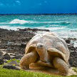

Here I have posted one original, unmodified picture and four modified ones. The first one on the left, top row, is the original picture. The rest:
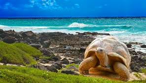
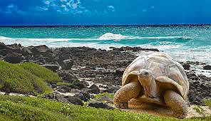
- Center, top row: Re-sized and cropped. I removed parts of the image and made it smaller. Cropping enables you to remove “extra” material, i.e. anything in the background you don’t want the audience to focus on. Re-sizing may alter the quality of the picture, especially if you make a picture bigger.
- Right corner, top row: Contrast and brightness. I decreased the brightness and increased the contrast of the picture. There is a very fine line here, because it is easy to go overboard with either one. If there is too much contrast, the image will look unnatural and lose detail due to increased saturation; if it’s too bright, it will also lose detail and make the background grainier. But you want to be able to SEE what’s in the picture and make it look vivid.
- Left, bottom row: Saturation. I increased the saturation a tiny bit here. Saturation increases the vividity and richness of colors, which is good if the picture is somewhat dull or muted. Like mentioned before, increase saturation too much and the image will look unnatural and lose detail.
- Right, bottom row: Sharpness. I sharpened the image a little bit for this one. Sharpening helps the image look clearer and crisper, if needed, by enhancing the edges and borders of objects. Too much sharpness will make the image look worse, exaggerated and less-detailed.
I have used these functions before in today’s social media age, but it is good to know the reasons WHY behind some of them, WHY certain functions make pictures look the way they do.
Toodle-oo!
